
Thanksgiving is coming. Time for turkey, stuffing, and those inevitable Thanksgiving debates with your favorite (?) uncle, aunt, or grandparent. What will you say when Uncle Jimmy waxes poetic about how we don’t need a social safety net. After all, he says, every American has an equal shot of achieving the American Dream? Or, when grandma claims that it is about time Affirmative Action faced its end because discrimination is a thing of the past?
Well, I’ve written a book that I promise can help you in this most unfortunate of holiday traditions. And, below I’ve provided a free preview of the first chapter. If you like what you read, buy it (there is a link here, at the bottom of the page, and on the side bar). And, if you enjoy the book, give it a nice rating on Amazon!
The Six Facts
Without data, you’re just another person with an opinion.
W. Edwards Deming, Statistician and Inventor of Statistical Quality Control
I want to tell you a secret, and I want you to listen closely. The U.S. economy is failing the majority of its citizens. Hey, I didn’t say it was a fun secret!
To convince you that we have a problem, I want to introduce you to six “Stylized Facts” about inequality in the United States. Stylized facts are not facts after a trip to The Gap (cue riotous laughter). Instead, stylized facts are simple, well-documented correlations or trends that are widely agreed upon. The “widely agreed upon” part is important to me. We can disagree about some of the causes of these inequalities. We can certainly disagree about the best solutions. What we cannot disagree about is that these inequalities exist in the first place. If you can understand these trends, then you can understand the harrowing situation facing our country.
Here they are:
- Middle-income workers have seen their real wages decline.
- Women’s progress towards equality with men has stalled.
- Economic inequality is causing families to fall apart.
- Black people have made no progress towards economic equality with white people.
- The incomes of rich people have exploded.
- A child’s income is highly correlated with their parents’ income.
I don’t list these facts in order of importance. Not at all. Instead, I list them in the order that it makes sense to cover them. For example, if you want to know why Black people are struggling, then you have to first know why middle-income workers are struggling. Because, in addition to issues like discrimination unique to Black people, Black individuals are also acutely affected by trends that hurt the middle-class. And, the inequalities that are tearing at all American families cause special problems for Black households. So, my hope is that when we get to the chapter on racial inequality, you will see that the things you have learned along the way can help you understand the issues that Black people face all the better.
Without further ado let’s dive into some data.
The Falling Middle
In the U.S., we have a belief that things get better. Sadly, the way that we think is wrong. And in no place is this wrong way of thinking more evident than in the wages of men. Wait a second…did he say men? Aren’t men doing awesome?
I admit, starting with men may seem weird for a book on inequality. But bear with me. Men are like the canary in the coal mine when it comes to economic trends. As we will see below, a lot has changed for women. Those changes – especially more work experience and more education – tend to drive women’s wages up. While that’s good news, it also masks bad things that are happening right beneath the surface. But, men haven’t seen so many changes. So, men’s wages are more of a reflection of how the changing structure of the economy impacts workers; there aren’t as many moving parts.
And, that reflection looks pretty darn bad. The graph below shows two lines related to men’s wages over the last four decades. The red line is the “median” male worker’s annual earnings.[1] This line represents the point where half of men are earning less and half are earning more, i.e., the middle. The black line is the “95th percentile” worker. This worker makes more than 95 percent of other workers. So, the graph basically shows the “middle-class worker” versus an “upper-class worker.” The big takeaway: that red line has dropped.

To me, that red line is terrifying. During a four decade stretch, middle-class workers lost ground. For context, GDP per capita – a measure of how much income is available in the economy – more than doubled. I repeat: national income up, middle-income worker income down. If that doesn’t give you the heeby jeebies (which is an official economics term), then you have a stronger stomach than me.
On the other hand, our 95th percentile worker did see growth in their income. Although…that growth is less impressive than it seems. That black line went up by 58 percent between 1975 and 2020. While that’s a lot bigger than the negative 4 percent experienced by the middle-class, it’s still way less growth than the doubling experienced by the entire economy. If the amount of income per person doubled, how is it possible that no person in my awesome graph saw this amount of growth? I’ll tell you how. So much growth went to the tippy top that even workers doing pretty darn well saw less growth than we’d expect. This observation gets us to our first stylized fact.

Stalled Women
At a first glance, the case of women’s earnings since the 1970s seems more positive than for men. Whereas the median man’s earnings declined, the median woman’s earnings went up 37 percent – from $36,680 in 1975 to $50,313 in 2020. The fact that women’s income grew faster than men’s means that women have begun catching up to men in terms of earnings. That’s progress towards a more equal society!
But while that push towards equality represents some good news, I wouldn’t be an economist if I didn’t follow it up with some sort of downer. And here it is. You know how they say that women make 80 cents on the dollar relative to men? Well, that’s pretty much true. The ratio of the median woman’s to the median man’s income in 2020 was about 83 percent. Indeed, that ratio has been right around 80 percent since around the turn of the century. Progress seems to have stalled. So, there’s your downer. I wonder why no one invites me to parties…
The picture below illustrates both the progress and the stall. This time, the red line shows the ratio of full-time working women’s to men’s earnings. Between 1975 and the early 2000s, the red line ticked slowly upwards, towards equality. In 2000, it started ticking slowly sideways into a future of continued inequality. (It’s a bit unclear whether the uptick from 2019 to 2020 is real or just a data blip…time will tell.)
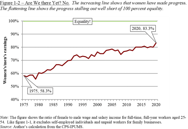
If you think that this lack of progress is sad, then wait until we talk about families and racial inequality. But, before then, let’s box up our second stylized fact.

The Decline of Marriage
So far, we have seen that middle-income men are making slightly less today than in the past. But, women in the middle have seen their incomes rise somewhat dramatically. As we discussed, working women are making more than ever. But, on top of that, women are working more than in the past. In the 1970s, just 55 percent of women were in the labor force. By 2020, that number was around 75 percent. These facts raise the possibility of actual good news. After all, many households consist of a married man and woman. So, even though men have lost out, perhaps families are doing great, as working women raise the income of their households. That trend would be awesome!
That trend also hasn’t happened.[2] But the reason isn’t that women aren’t making enough to pick up the slack. Instead, more often than in the past, people are single. Marriage rates are falling. And they’re falling the most for groups where middle-class workers are struggling.
For an example, let’s look at people with a high-school degree. As we will see later, education is becoming a more and more important marker of economic well-being. Between 1975 and 2020, the marriage rate for those with a high school degree fell dramatically – from 85 percent to just above 50 percent. Not coincidentally, in 1975, the typical man with a high school degree could make a good living – a little over $60,000 a year. By 2020, it had fallen into the $45,000 range. That’s a decline of 25 percent. College graduates experienced neither the same-sized decline in marriage nor in earnings.
I’m not a social conservative who thinks marriage is important for its own sake. But, people within households share resources and risk, and the reduction of marriage therefore can weaken economic well-being.[3] Plus, as we will discuss later, a growing body of evidence suggests that having two parents in a household can improve economic opportunity for children. Yet, marriage is being destroyed by the decline of the middle class. If there’s some area in which a social conservative and a liberal can agree, it’s that this trend is bad. And yet, we continue to let the middle-class suffer.
But, I am getting a bit ahead of myself. For now, let’s box up our third stylized fact.

Persistent Racial Inequality
So far, I have showed you some pretty bad trends. Perhaps it is time for some redemption. After all, in the four decades since the mid-1970s, one expects the U.S. to have made some progress in reducing the racial income gap. Right? Wrong.
The inequality between Black people and white people can either look bad or really bad, depending on how you look at the data. The “bad” way of looking at the data is to focus on individual workers, not entire families. In 1975 Black men made about 74 percent what white men made. By 2020, that number was…wait for it…77 percent. That’s four decades and almost no progress. And while Black women fare a bit better at 81 percent of their white counterparts, that ratio has actually declined since 1975 when it sat at 92 percent. So, Black workers have either made little or negative progress in obtaining income equality. And that’s the optimistic way to look at the data.
The really bad way of looking at racial inequality in the U.S. is to look at family income. In 2020, the typical white household made $95,000. The typical Black household made $52,000 – basically half of the typical white household. Figure 1-3 shows how these numbers have evolved over time. The red line represents the typical Black household and the grey line represents the typical white household. The grey bars in the background represent the ratio of the two. And those grey bars illustrate one awful fact – Black families have lost ground on white households since 1975.

The fact that household inequality between Black families and white families is worse than individual inequality is a topic we will come back to later. But for now, just know that whatever racial progress you may think we’ve made, it doesn’t show up in a pretty important economic indicator – income. This observation gets us to our fourth stylized fact.

Before we finish up this chapter, we need to talk about the income growth for one last group – the very highest earners. Like I said earlier, income per person has doubled over the last forty years in the U.S. You have now learned that this income did not go to people in the middle. So where did it go? To people at the very, very top.
A Growing Slice to the Rich
When I first introduce these stylized facts to my classes, I explain that most of the people near the top of the income distribution are people that they could know. For example, the 95th percentile male worker makes about $200,000 from wages and salary per year. This individual is doing well, obviously. They are a lawyer, or a high-level manager at a large employer, or a financial adviser, an engineer, etc. These workers have seen their incomes increase much faster than workers in the middle. However, the economics that explains these high-earning workers’ income growth is very different than what explains the growth in very high-earning workers’ income. But, we’ll get to that. For now, let’s just stick to the basics.
Unfortunately, those basics are actually kind of difficult to figure out. The data I have been using for all of the facts so far – The Current Population Survey – hides the earnings of very high-income individuals. This hiding is done for privacy reasons. If only one person in the country makes $5,039,390 per year, then I could identify that person and learn all kinds of other stuff about them – like their health and marital status – from the data.
Fortunately, some excellent economists (far better than me) – Thomas Piketty, Emmanuel Saez, and Gabriel Zucman – have done work calculating the incomes of the very rich, and I present some of their results below in Figure 1-4. The redline shows the average income for the top 1 percent of earners and compares it to the grey line, which is meant to represent workers in the middle.[4] For context, if you were in a room of 100 people, the figure shows what has happened to the top earner’s income over the last 40 years versus the 50th to 90th highest earners.

Two things about the figure. First of all, you’d be forgiven for confusing the grey line representing the middle class with the x-axis…it’s just that darn low compared to high earners. Second, the red line has increased by 262 percent since 1975, from about $408,000 a year to $1,383,000 per year. As I told you, GDP per capita more than doubled since the mid-1970s. And, as I told you, that growth sure as heck didn’t go to the middle. You want to know where it went? Look up. That’s the fifth stylized fact. Let’s box it up before turning to our sixth and final stylized fact on economic opportunity.

A Lack of Opportunity
As humans, we all enjoy some good, old-fashioned rationalization. It’s tempting to say something like: “Sure, the rich are doing really well. But, at least everyone in the U.S. has an equal chance to get rich.” And, that would be awesome if it were true. It isn’t. The truth is that each person’s income as an adult is strongly correlated with their parents’ income. It’s not what you want.
The reasons for this correlation – and indeed how we should even think about it – are complicated. But our future selves can deal with the complication when we get to the end of this book. This chapter is just about data – and the data tell a clear story. For example, a kid whose parents are in the 10th percentile of the income distribution – i.e., poorer than 90 percent of people – has about a 20 percent chance of attending college.[5] For a kid whose parents are richer than 90 percent of people, that number is over 80 percent. Perhaps we shouldn’t be surprised therefore that kids whose parents are in the top 20 percent of earners are three times more likely to end up high-earners themselves than kids whose parents are of more modest means.
In America, it is true that everyone has a chance to make it to the top. It’s just that the chance is a lot smaller if you’re born poor. It’s possibility versus probability…and probability often wins. That’s the sixth stylized fact.

Taken together, these six stylized facts indicate a world of persistent and in some cases growing inequality. Middle-class men have seen real declines in income. Although women have partially caught up to men, the median woman still earns considerably less than the median man and progress has slowed to a crawl. Families are struggling and marriage is declining. When we look at things by race, the picture is no better. The inequality between white and Black workers and households has been shockingly persistent over the last forty years. It seems that the only people doing much better are those at the very top. And all of these inequalities would be a lot easier to handle if low-income kids had an equal chance to climb…but, they don’t.
If all of these numbers and statistics makes you wonder “why?” or maybe “what the f&*k,” then you are in luck…because that is the entire point of the next six chapters!
Preview Chapter Over…if you liked it…buy it!
[1] Boring footnote alert! Throughout this book, I often restrict the sample to those aged 25 to 54 to limit the effects of the recent aging of the population. I will also restrict the sample to those individuals working full-time and at least 40 weeks a year to limit the effect of changing work schedules, an especially important issue for women. Finally, I will often exclude the self-employed since the nature of their income tends to be more variable than more traditional workers, and they comprise less than 10 percent of the working population over the time period examined.
[2] At this point, you should probably just adjust yourself to the fact that most of the things in this book are going to be kind of bad. Except for the learning, that’s good.
[3] Every year I submit an anniversary card to Hallmark with the slogan “Thank you for another year of marriage, and sharing risk with me.” Every year, they reject me. Strange.
[4] Before you view the figure, one note is important: the figure shows all sources of income, not just income from labor as many of the prior figures did. This point is important, since the very rich get much of their income from capital (e.g., stocks and bonds), something we will talk about a lot more later on in the book.
[5] See Chetty et al. (2014) if you want to read more. These authors also maintain an excellent database at www.opportunityinsights.org if you are curious. Be curious!